Chart Types
In This Topic
With krewDashboard, you can visualize the aggregation result of kintone app data in the form of charts or pivot table. Charts help you interpret the displayed data quickly and accurately.
Below are the types of charts that can be selected (including pivot tables and text) and their user scenarios.
| Chart Type | Description |
|---|---|
Column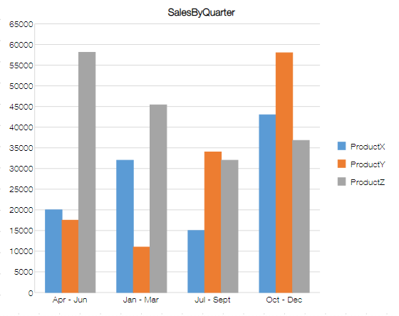 |
This chart is suitable for comparing the size of cumulative values of each category. |
Stacked Column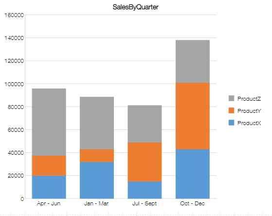 |
This chart is most suited for comparing the part-to-whole ratio and cumulative values of each category. |
100% Stacked Column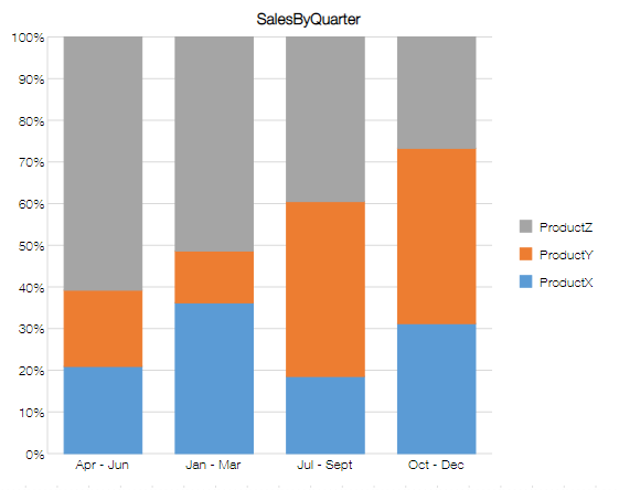 |
This chart is most useful for comparing the percentage share of each category towards the total. |
Line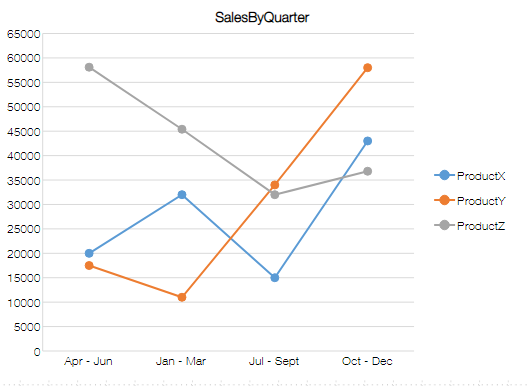 |
This chart is apt for demonstrating change in values over a period of time. |
Stacked Line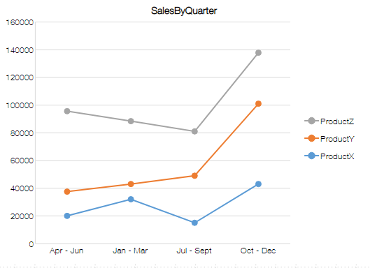 |
This chart is suitable for demonstrating change in aggregated values and change in the total value over time. If the stacked line chart is not clear, consider using a stacked area chart. |
100% Stacked Line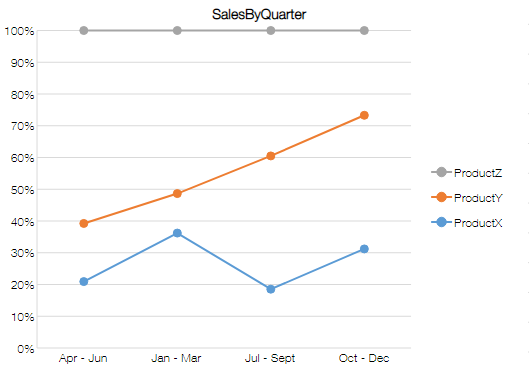 |
This chart demonstrates change in ratio of the aggregated value of each category to the whole over a period of time. If the stacked line chart is not clear, consider using a 100% stacked area chart. |
Pie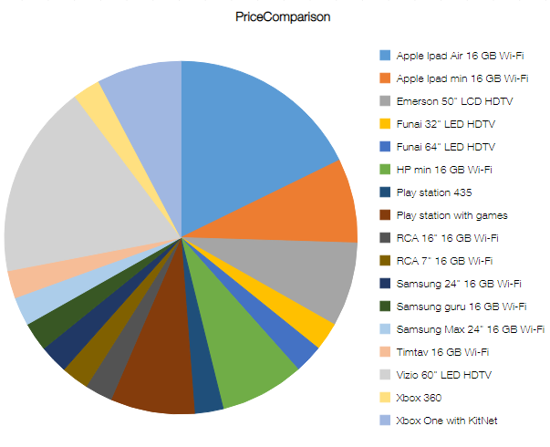 |
This chart is appropriate for presenting percentage share of a category towards the whole. |
Doughnut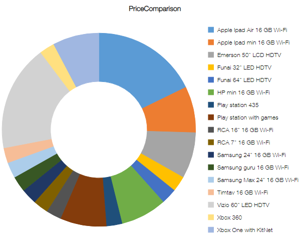 |
This chart is appropriate for presenting percentage share of a category towards the whole. |
Bar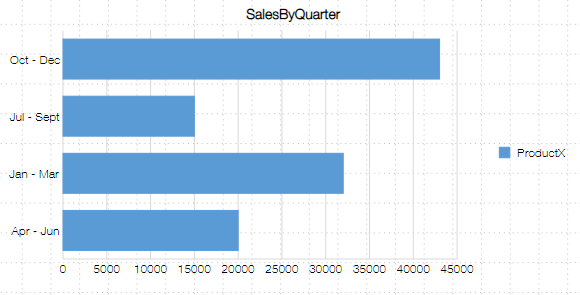 |
This chart can be used to compare magnitude of aggregated values for each category. Bar charts are better than column charts when category strings are long. |
Stacked Bar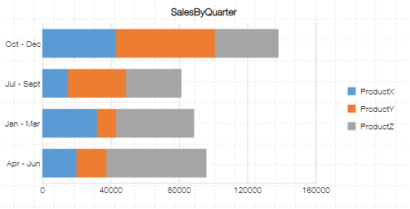 |
This chart is most suited for comparing the part-to-whole ratio and cumulative values of each category. Bar charts are better than column charts when category strings are long. |
100% Stacked Bar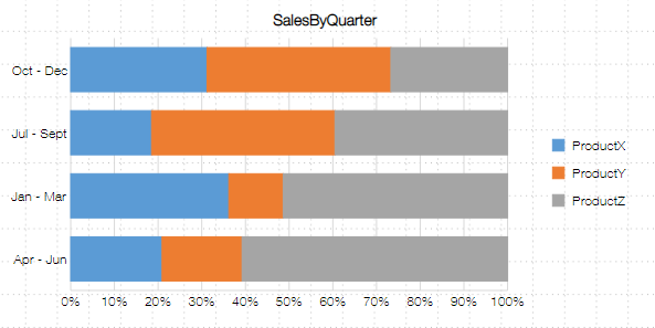 |
This chart is most useful for comparing the percentage share of each category towards the whole. Bar charts are better than column charts when category strings are long. |
Area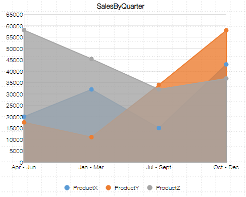 |
This chart is suitable for expressing change in the aggregated value and difference in the aggregated value for each category over a period of time. |
Stacked Area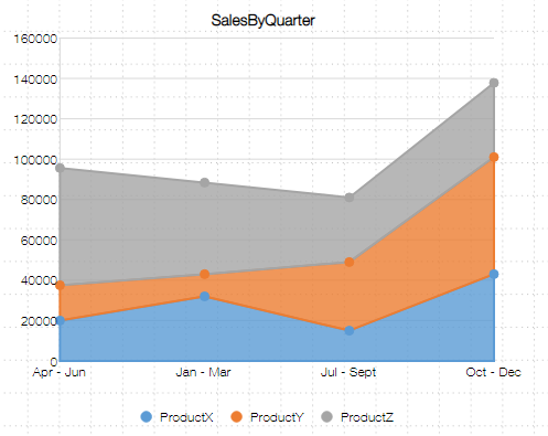 |
This chart is used to represent change in the aggregated value for each category and change in total value of the whole over a period of time. |
100% Stacked Area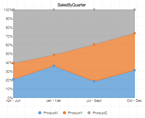 |
This chart is most suited for demonstrating change in ratio of the aggregated value of each category to the whole over a period of time. |
Scatter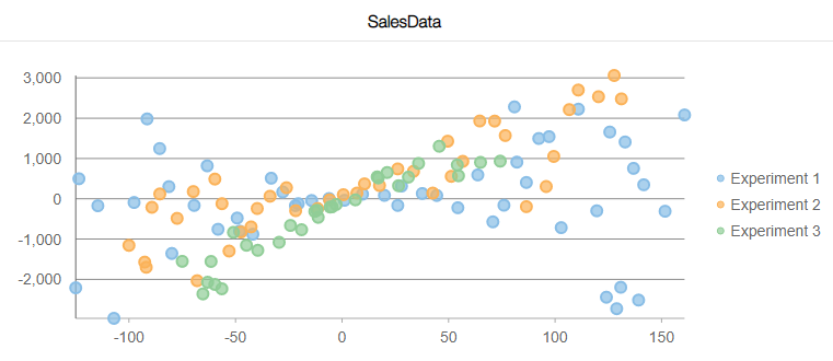 |
This chart is suitable for understanding correlation between two sets of values. |
Bubble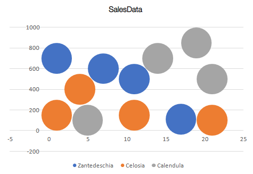 |
This chart is suitable for understanding correlation between three sets of values. |
Radar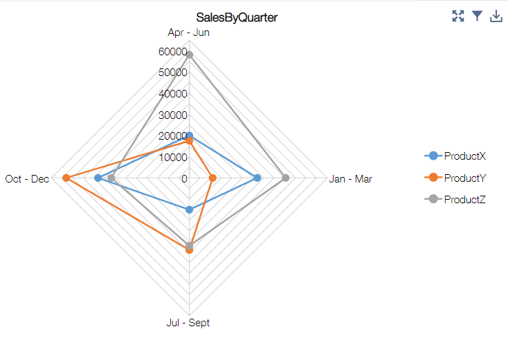 |
This chart is apt for checking overall balance of the data. |
Filled Radar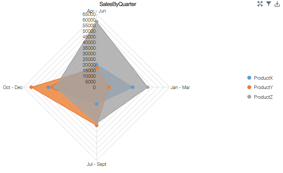 |
This chart is apt for checking overall balance of the data. |
Funnel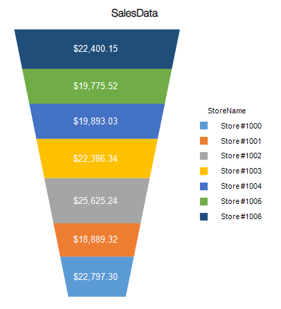 |
This chart is used for demonstrating the gradual reduction in data as it moves through various stages of a process. |
Composite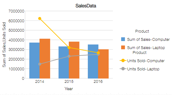 |
This chart is used to represent different types of information. |
Number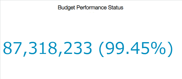 |
This chart is suitable for grasping the aggregated values. |
Gauge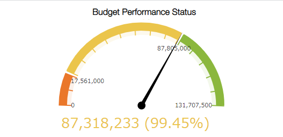 |
This chart is helpful in indicating the progress against a goal. |
Pivot Table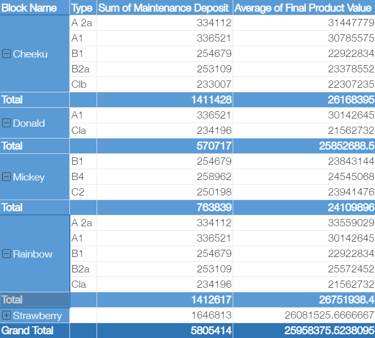 |
A pivot table is suitable when focusing on the result numbers themselves rather than differences and changes in the aggregated results. |
Text |
Text can be used for supplementary purposes, such as displaying important information or creating a link to a site that contains additional information. |
Slicer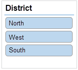 |
Slicer is used to filter the data in charts and pivot tables that use same data app in the dashboard. |
Timeline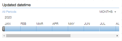 |
Timeline is used to filter the data in charts and pivot tables that use same data app in the dashboard by specifying the aggregation time period. |
See Also