Conditional Formatting of Chart
In This Topic
Considering performance and consumption of kintone API, up to 500 data records are fetched on the Plug-in Settings page of krewDashboard. Chart on krewDashboard may change dynamically at runtime, and you cannot style it individually like in Excel on the Plug-in Settings page. Instead, you can use conditional formatting to style the chart elements that meet a specified condition.
Set Conditional Formatting
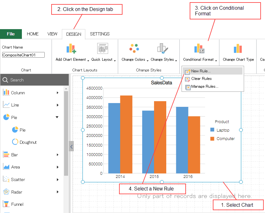
You can set the conditional formatting by clicking Conditional Format on the Design tab of ribbon area. Steps to apply conditional formatting are similar to that of setting conditional formatting in pivot table of Excel. For details about rules, see the description given below.
Specified Values
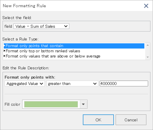
You can set a condition to automatically color the data that matches the specified condition such as "3 million or more" and "10 or less".
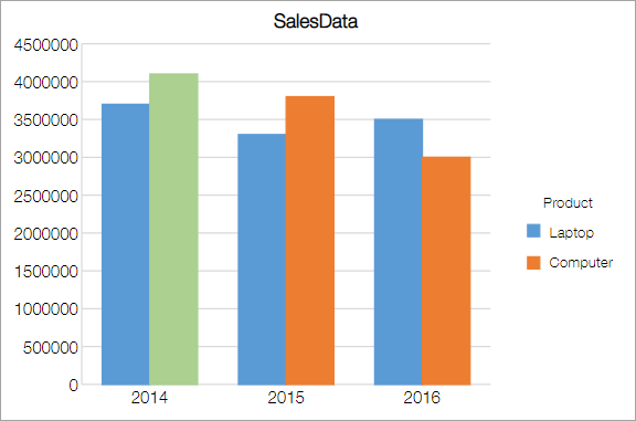
Example) Set color of the chart element whose aggregated value is "4 million" or more.
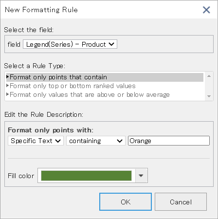
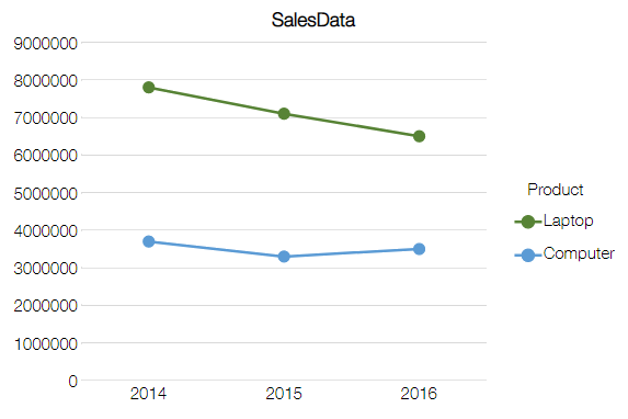
Example) Set color of the line and marker whose Legend(Series) is "Orange"
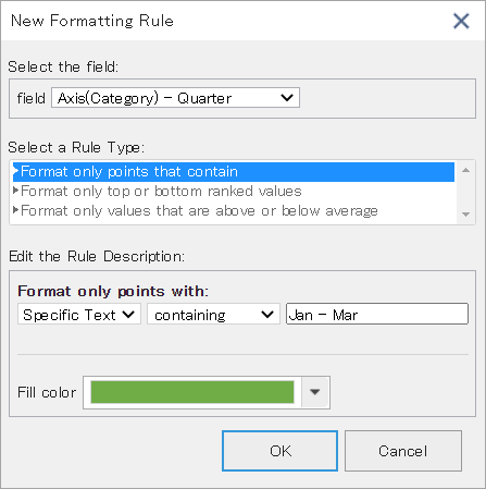
Example) Set color of the chart element for which axis (category) is "Jan - Mar"
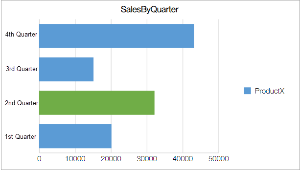
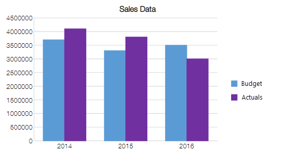
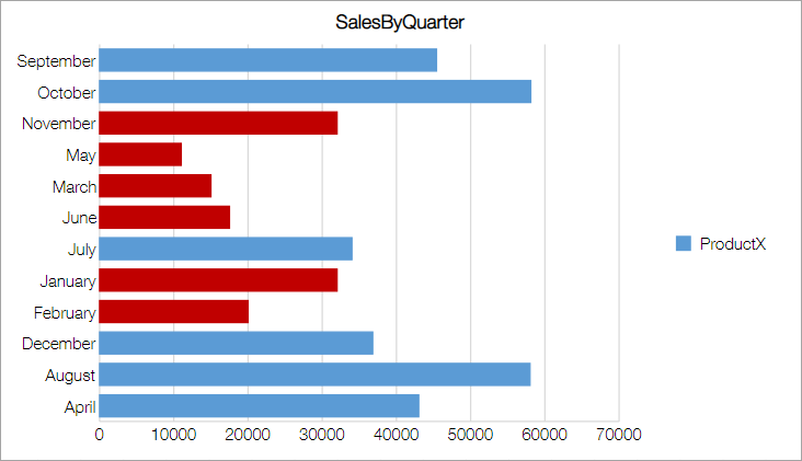
Example) Set color of the chart element with "Actuals" among the two values "Budget" and "Actuals"
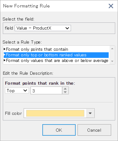
Top or Bottom Values
Instead of using a fixed numbers such as "3 million or more" or "10 or less" as a condition, you can set to automatically color the data that matches a specified range such as "Top 3" or "Bottom 5".
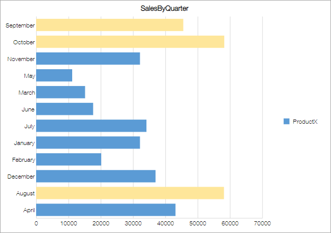
Example) Set color of the chart elements with top 3 aggregated values
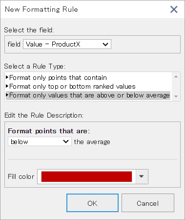
Above or Below Average
You can automatically color the data records which are above or below the average value.
Example) Set color of the chart elements which are below average
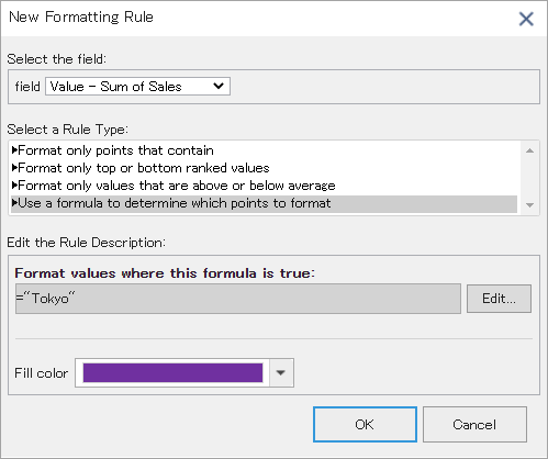
Use Formula
You can set conditional formatting on data records that match the condition specified using formula.
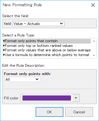
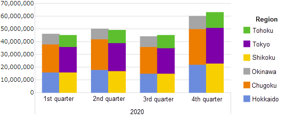
Example) Set color on chart elements with value "Actuals" and Legend(Series) as "Tokyo".
Rules that can be specified differ depending on the fields such as value field that displays the aggregated value and the Legend(series) field that handles strings. The types of rules that can be specified in each field are as follows.
| Field |
Specified Value |
Top or Bottom |
Above or Below Average |
Use Formula |
| Value |
〇 |
〇 |
〇 |
〇 |
Axis (Category)
Number/Date/Time |
〇 |
〇 |
〇 |
× |
Axis (Category)
Other than Number/Date/Time |
〇 |
× |
× |
× |
Legend (Series)
Number/Date/Time |
〇 |
〇 |
〇 |
× |
Legend (Series)
Other than Number/Date/Time |
〇 |
× |
× |
× |
Following table lists the places which are formatted in each chart type. Use the legend field to set color on line of the Line chart. Number and gauge do not support this feature. For pivot table, see Conditional Formatting of Pivot Table.
| Chart Type |
Value |
Axis (Category) |
Legend (Series) |
| Column |
Element |
Element |
Element |
| Stacked Column |
Element |
Element |
Element |
| 100% Stacked Column |
Element |
Element |
Element |
| Line |
Marker |
Marker |
Line/Marker |
| Stacked Line |
Marker |
Marker |
Line/Marker |
| 100% Stacked Line |
Marker |
Marker |
Line/Marker |
| Pie |
Element |
|
Element |
| Doughnut |
Element |
|
Element |
| Bar |
Element |
Element |
Element |
| Stacked Bar |
Element |
Element |
Element |
| 100% Stacked Bar |
Element |
Element |
Element |
| Area |
Marker |
Marker |
Area/Line/Marker |
| Stacked Area |
Marker |
Marker |
Area/Line/Marker |
| 100% Stacked Area |
Marker |
Marker |
Area/Line/Marker |
| Scatter |
Point |
|
Point |
| Bubble |
Bubble |
|
Bubble |
| Radar |
Marker |
Marker |
Line/Marker |
| Filled Radar |
Marker |
Marker |
Area/Line/Marker |
| Funnel |
Element |
|
Element |
See Also